Forefront’s Monday Market Update
What the heck is going on?
In a time when getting news and data has never been easier, it has never been harder to get ACTUAL data and news without an agenda behind it. All news stations are in the business of selling advertising, and your eyeballs watching/reading is the product they are selling. We must always remember their business isn’t to provide you financial advice or guidance, or even to tell you the unbiased news. Their job is to illicit an emotional response so you continue to watch.
So, what actually matters?
Rt and daily deaths are the two key statistics that matter the most according to most health experts. Not according to CNN, or the White House, or anyone else with an interest in swaying public opinion, but by leading health experts with no political agenda. What do these two key stats mean?
Rt is the rate of transmission. If R is below 1 that means for every person who has the virus, they will infect less than 1 person. This means the virus will die out. Over 1 means the virus will spread.
Increased case numbers are a function of testing, increased hospitalizations come after case numbers increase, followed by deaths which is a more important statistic.
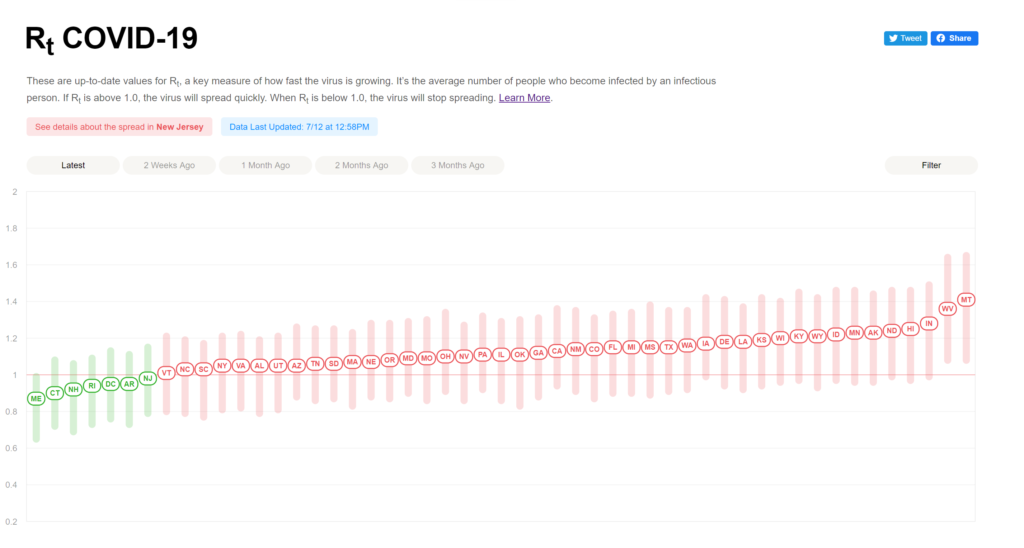
Rt broken down by state. For an interactive chart and source go here.
Why does this matter to you and I?
I have grown weary of talking heads on TV pontificating, without giving the public anything of substance. To break through all of the noise knowing how quickly the virus is being transmitted within your State and community and daily death count is important so you can make personal decisions that are best for you and your finances.
As we see daily deaths rise, we can clearly see the increase in cases over the past few weeks in Southern and Western States is leading to more people dying. If we are looking for the number one reason an economic shut down happens again, people dying at an alarming rate is it! Take a look at the chart below showing the weekly data on new cases, new hospitalizations, and deaths across the USA.
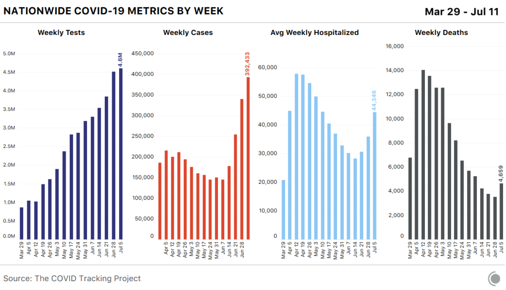
A few points about the above chart.
- Although testing has increased, new cases have risen more proportionately.
- Testing is starting to plateau which isn’t good.
- The lagging indicator of deaths has jumped up
These numbers are going to get worse before they get better, very similar to what the Northeast experienced in April and May. We are always monitoring the portfolios ready to make changes as they are necessary
What to look forward to this week.
- CPI and Core CPI data – Tuesday July 14th, 2020
- Fed Beige Book – Wednesday July 15th, 2020
- Jobless claims and continued Jobless Claims Thursday July 16th, 2020′
- Earnings season has arrived.
- Check below to see the major companies reporting earnings this week.

Don’t forget to check out last weeks episode of Forefront’s Friday Fun, and remember “its personal, not just business.”